Derita is Cool
Hey everyone! Things have cooled down here at Derita Design, not only because the 72 snowflakes are finally flying proud, but also because of a need to slow down and reflect after getting this project completed.
It has been around a calendar year since Charlotte Urban Design gifted a placemaking grant to Derita Design with the help of Theresa McDonald of Derita News/Derita-Statesville Rd-Neighborhood Association and Matthew Scott Honeycutt, a native of Derita and Artist.
As we know by now, things started off in a different direction, making a mural for the community on the side of an ice storage building. But the narrative of this project has taught me, Hasheem, that sometimes the project will tell you where and what it needs to be.
Thanks to Phil Harris, a Derita native, photographer, and real estate manager, we received the green light to use the old Derita Volunteer Firehouse as a new venue for art. Phil's unwavering confidence in our vision led us to design something fitting for the historic wooden tower at this location.
With this change of venue and the central location of the building, an old desire for a neighborhood sign surfaced. There had been a small sign at the corner of Gibbon Rd and Sugar Creek that was removed a few years ago, and since then there has been no signage letting the residents and visitors know and appreciate when they arrived in downtown Derita (Although, there is a certain charm that lets you know you are in a special place when you pass through).
The tower has a prominent corner as you approach from Pucketts/Maria’s and peeks above Andino’s when you appraoch from the other side. The idea was to announce Derita from whichever way you traverse through it. The tower also has 2 levels.
The intermediate level was the perfect place to make a ‘mobile’ for the snowflakes we collected from the community last summer. The snowflakes represent the way Derita gives you the freedom to be yourself but also can be beautifully united in our shared experiences.
Deborian Halsey
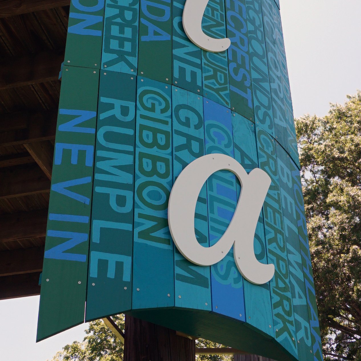
Local Derita artist Deborean Halsey was tapped to create a color palette for the signage. He came up with a few options, but the resounding favorite amongst the stakeholders was blue and green. In our first meeting about this new location, he remarked that he sees Derita as not a melting pot, but a Growing Pot. The green comes to symbolize the natural greenery of places like Nevin Park, Ribbon Walk and Theresa Elder Park. The blue symbolizes Irwin Creek, our past Natural Springs as well as the optimism of a new day in our neighborhood.
The signs themselves were created from treated pine. Using a common material symbolizes the blue-collar nature of our neighborhood. We are a hard working unglamourous community that sometimes the city overlooks. The pine came from just down the railroad at long time Charlotte staple McGee Lumber.
The horizontal sign contains the characteristics our community likes about living here which we collected at our neighborhood outreach events. The beginning of each letter spells out “dddddeeeeerrrrriiiiitttttaaaaa”. The sign slightly curved on the bottom with converging slats to point upwards towards the sky. This symbolizes the church steeples that dot our downtown as well as the fact that the highest point in Mecklenburg County can be found in Derita.
The vertical sign features a slightly curved assemblage of 54 slats. Each one containing a major road or neighborhood. Each one expertly painted by Deborean in alternating hues of blues and greens. The curve allows the sign to be read for longer as you traverse by.
Both signs are meant to appear as a single teal color from far away and start to individuate themselves the closer you get. This is meant to symbolize, like the snowflakes, a united front that allows expression on a personal level.
Lastly, the ‘Derita’ itself was the choice of Phil Harris. He said the font reminded him of when he went to school here in Derita as a boy. The font gives a fun, strong and optimistic feel to the surrounding area.
This project was such a great learning a growing experience for Derita Design. Hopefully this sign instills a sense of place and pride in an opt overlooked area.
Thanks to Rob Hausmann for his art installation services.
The day the sign went up, a passerby remarked, “You’re putting Derita on the map!”


